Real Sprites in CSS
Tagged with: experiment, css
At some time in the past, I made a blogpost about css animation, attempting to use what knowledge and specs existed at the time to use good old sprite animations in conjunction with plain old HTML. Those bungling attempts can be much approved upon these days and I intend to show how in this post.
Why Sprites using CSS?
Sprites are still an awesome solution for creating simple animations. They are still in use to this day and that's because they are easy to grasp. So, why do this with HTML and CSS?
I personally believe that for many simple problems, we should use simple solutions. Using the Canvas Object for rendering simple 2D games, for instance, is to me like using the proverbial hammer to break an egg. Instead, with browser vendors doing their best to improve rendering performance, why not leverage those efforts?
Something borrowed
For my attempt at creating this post I've borrowed a sprite-sheet. As I like Gambit, this is the one I chose to addept for my attempts:
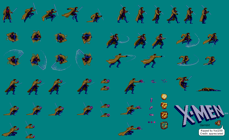
To make working with sprites a little more straight-forward, I prefer to use a fixed grid. Also, as this sprite is probably ripped from an old arcade machine, transparency is embedded using a unique color that is not used in the actual character. Some small fixes to be done for my own preference and I'll get going.
All there is to it
In practice it's pretty easy to animate sprites using CSS. As mentioned, you'll need to create the sprites with pre-set frame-sizes. Considdering the size of the Gambit sprites I went with 70 pixels, adding 5 pixels worth of padding, gets you to a nice number to calculate with too ;). Having 6 frames to work with that gets us to a total of 450 pixels for the entire strip.
So, the animation is pretty easy, at 0% set the background-image, set the starting background-position, then at 100% set the end-position. What I found a little weird is what you're setting is actually the full width of the sprite-strip, instead of the left-hand edge of the final frame.
@keyframes play {
    100% { background-position: -450px; }
}
.gambit:hover {
    animation: play 1s steps(6) infinite;
}
Can we do that Responsively?
I suppose it'd be boring to leave you with just that simple example. So, here's some food for thought. I like to mix in some relative font-sizes when I'm trying to come up with responsive behaviour. However, images are terribly pixelated ;) So, in order to make that work there needs to be some form of translation.
The trick is easy enough though, provided some things are well within our control. Let's
see how we'd do this on our gambit sprite. It's all about relative sizes, in this case I'm
going to decide to make the sprite the height of the text, being 1em, now the original
height was 80 pixels and the width 70 pixels, doing the math is simple 7/8th times 1em
should get us the width we're looking for, being 0.875em.
The next challenge is making the sprite fit these new dimensions. Some more math is going
to come to the rescue. We can set the background-size, having only a single strip of
sprites makes it easy, auto 100% will set the width automatically while matching the
height of the element and keeping the aspect ratio.
The final puzzle then is the final background-position. Again, it's about the aspect
ratio, but don't forget about the padding. So, again we start with the correct height of
80, the sprite-cell width of 75, the total amount of sprites at 6 getting us to the
following formula of -7.5/8 * 6.
Using SCSS we can put these formulas straight into the styling:
.responsive {
    background-size: auto 100%;
    height: 1em; //80px
    width: (7/8) * 1em; //70px;;
}

@keyframes rplay {
    100% {
        //frames are 75px wide, and 6 of them...
        background-position: -(7.5/8 * 6em) 0;
  }
}
.responsive {
    animation: rplay 1s steps(6) infinite;
}
Which in CSS would come out as:
.responsive {
    background-size: auto 100%;
    height: 1em;
    width: 0.875em;
}

@keyframes rplay {
    100% {
        background-position: -5.625em 0;
    }
}
.responsive {
    animation: rplay 1s steps(6) infinite;
}
And there you have it, some way more reliable method for using CSS for sprite animations. I hope this stuff makes sense to you and may help somebody else use this as a quickstart to awesomeness ;).
One final word of warning. If you mix animations with transitions, things will go bump. As far as I can tell it has something to do with hardware acceleration and caching. Stopping and starting the animation before and after the transition will do the trick of course.