Roof-tiles in reverse
This article was originaly published in dutch on http://www.naarvoren.nl/artikel/stapelenmetcss/.
A short example to show how visual layout does not, by necessity, match your css-layout. Because, what you see isn't always what you're getting.
Introduction
Sometimes we get a visual design that truly grabs your attention. How the hell am I going to implement it, is usually the first question on your mind. Leaping ahead towards the common css skills in your repertoire you quickly sketch out how the visual elements stack together and form the visuals that are invented by some clever designer. Sometimes this default reaction runs into a wall, the usual suspect being anti-aliased rounded border on gradient backgrounds, or several backgrounds with separate mono background-colors. So, here's a short paper on how to take a different approach to come up with an answer to some of those tricky layouts. I hope it will serve you to find equally simple solutions to a wide range of visual challenges.
The challenge
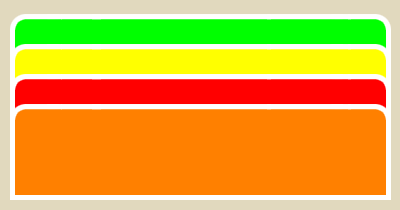 My example will be based around a design with 'vertical tabs' which are stacked like roof-tiles, and of which the corners are rounded and anti-aliased. Also, each tab will have a different background-color, while all of them will have a white border around them.
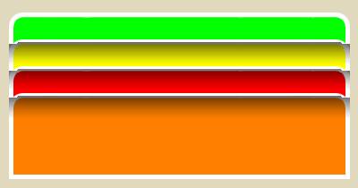 Now, to make matters worse, more tabs may be present, or less, and the order of the colors may differ. And, off course we want our rounded corners anti-aliased to the background of the tab underneath. A colleague at work suggested making the top half of the top-border part of the bottom of one image and then the bottom half of top-border part of the other, this however presents a problem with the top-most image. However he planted the seed for a solution that may make you think again next time you visualize your css sketches in your head.
The basic idea was good, real good. Why not add that anti-aliased part of the border to the bottom of the tab? But to make it somewhat easier on myself I wanted the top always to have a full border, anti-aliased to the background-color of the document. So, I decided to make each individual tab with the top-border and a blue background behind the tab and then reverse the visual stacking order so that the bottom of each tab is displayed on top of the next tab. Indulge me, I will continue with more detail.
The markup
I'll start by creating a list of links, which can be styled simply to support one single color of tabs.
<ul class="rooftiles">
  <li><a href="#1">subject1</a></li>
  <li><a href="#2">subject2</a></li>
  <li><a href="#3">subject3</a></li>
</ul>
With some fairly simple styles we can set up the basics for the list we wanted. First we strip the list of it's usual list-styles and turn it back into a normal block-level element.
ul {
  margin: 0;
  padding: 10px 0 0; /*Accommodate negative margins*/
  list-style: none;
  width: 100px;
}
We then continue by setting up the list-items to display the prepared background-image, starting with the green one as a basic setup. Also at this stage we use a negative margin to slide the list-items underneath each other like that stack of roof-tiles I mentioned earlier.
li {
  background-color: transparent;
  background-image: url( images/green_top.gif);
  background-repeat: no-repeat;
  background-position: 0 0;
  height: 22px;
  padding: 7px 10px 15px;
  text-align: center;
  margin-top: -15px; /*Stack list-items*/
  position: relative;
}
This would off course still leave the list-items with their usual stacking order, leaving us with an ugly sight. So, we'll need to reverse the stacking order. This does require a line of css-code for each list-item in the list, preventing us from making this a setup of an arbitrary number of list-items, however, the code is simple enough to allow us to code for a preset maximum of list-items. The following code is the start of a preset maximum of 10.
li { z-index: 10; } /*Reverse z-indexes*/
li+li { z-index: 9; }
li+li+li { z-index: 8; }
...
I'm pretty sure you're anxious the see the intermediate results, even though some browsers won't quite get it right at this point yet.
What makes Microsoft happy
We wouldn't be in this mess if it weren't for internet explorer's lack of proper png support off course. So, as some of you may have noticed, we'll need to replace the sibling selectors with something else. We don't have much choice but to rely on classes here.
And while we're on the subject of adding a few classes into the mix, there's the matter of dispensing our color palette to the tabs, they're not supposed to be one single color after all. I've decided to use classes to define the different colors, id's would've done just as well except that I don't want to rule out using several of these tabbed lists on a single page, possibly sharing a few of the colors. I'll leave the decision up to you, my example will be using classes though.
<ul class="rooftiles">
  <li class="row1 subject1">
    <a href="#1">subject1</a>
  </li>
  <li class="row2 subject2">
    <a href="#2">subject2</a>
  </li>
  <li class="row3 subject3">
    <a href="#3">subject3</a>
  </li>
</ul>
And to top it all up here's the styles to make this idea take hold
 /*Make the list-items reverse z-indexes*/
.row1 { z-index: 10; }
.row2 { z-index: 9; }
.row3 { z-index: 8; }
.row4 { z-index: 7; }

/*Spice it up with some colors*/
.subject2 {
  background-image: url(images/red_top.gif);
}
.subject3 {
  background-image: url(images/yellow_top.gif);
}
The usual suspects among the browsers will be able to paint a nice picture using all of these styles.
The grande finale ;)
I hope this little example of how to think different was enjoyable to you, I certainly had quite a lot of fun cooking it up and writing it down. I realize that in my last example I still did not add the orange colored content-pane and I hope this last example will make it up with you as I've thrown a vertical sliding doors technique into the mix to accommodate multiple lines for subjects, as well as adding a little more depth to the graphical illusion.